Render the bare minimum, minimally invasive, LQIP-included HTML code to represent responsive images, served in multiple widths and next-gen formats.
Install
$ npm i -D @zerodevx/svelte-imgAdd imagetools plugin into your vite.config.js:
import { defineConfig } from 'vite'
import { sveltekit } from '@sveltejs/kit/vite'
import { imagetools } from '@zerodevx/svelte-img/vite'

export default defineConfig({
  plugins: [sveltekit(), imagetools()]
})
Use
Anywhere in your svelte app:
<script>
  import cat from '$lib/assets/cat.jpg?as=run'
  import Img from '@zerodevx/svelte-img'
</script>

<Img class="cool kitty" src={cat} alt="Very meow" />
Showcase
By default, the original image is transformed into 9 variants - 480/1024/1920
widths at avif/webp/jpg formats, with an inline base64 low-quality image
placeholder (LQIP) background.
The LQIP is typically a 16px webp;base64 data URI at about ≈150 bytes.
It's not recommended, but you can apply a Gaussian blur backdrop-filter.
Not much difference, is there? The next image has a dominant colour placeholder instead.
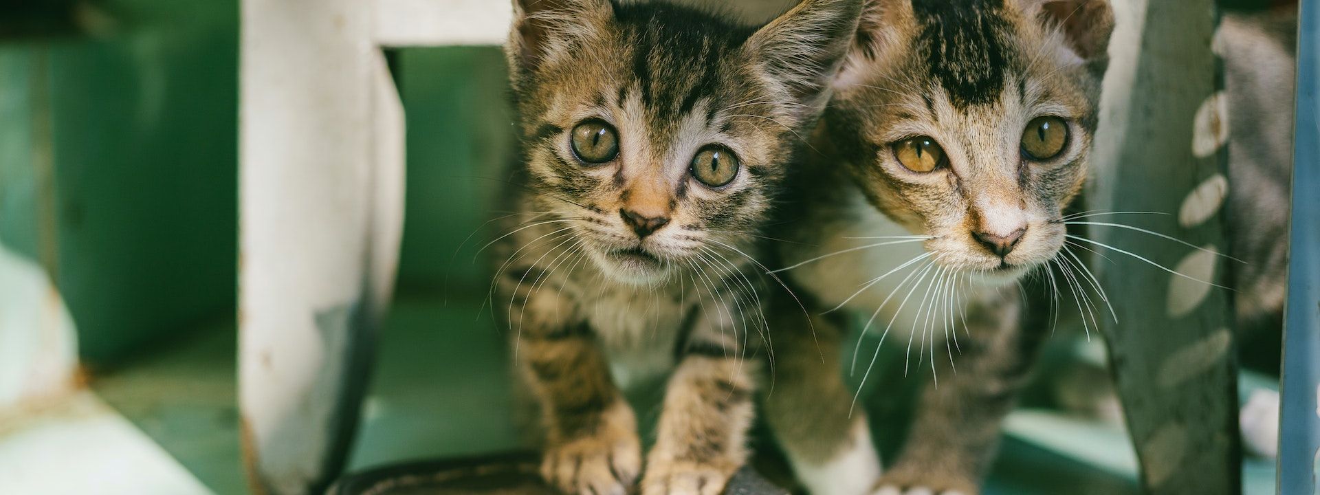
Which looks like this.
You can also reveal images with fade-in special effects.
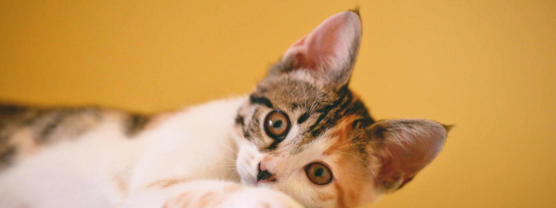


Or even apply parallax scrolling special effects.

Thesvelte-imgcomponent tries, as much as possible, to be a drop-in replacement for the native HTML<img>tag.
Side-effects are kept to a minimum, so things should still work even without JavaScript. Try it - disable JS on this page and refresh, and check out the Lighthouse score too.
The next example however does require JavaScript, because interactivity. It uses the
Vite pattern for glob imports to load a local directory of images, like so:
const modules = import.meta.glob('$lib/assets/sm/*.jpg', {
  import: 'default',
  eager: true,
  query: { w: 640, h: 640, fit: 'cover', as: 'run' }
})

const images = Object.entries(modules).map((i) => i[1])
